
Homepages get designed by committee, and committees add. Everyone has something that belongs above the fold. The result is a page that says everything and communicates nothing, which is the most common website failure there is.
The homepage has one job: help a stranger work out, quickly, whether they are in the right place and what to do next. Almost everything else on a typical homepage is working against that.
The test
Open your homepage on a phone. Look at it for five seconds. Close it.
Can you answer three questions? What does this business do. Where does it do it. What do I do next.
If any of those takes longer than five seconds, the page needs work regardless of how good it looks.
Better version of the test: hand your phone to someone who does not know your business and ask them those three questions. You are the least reliable judge of your own homepage because you already know all the answers.
What belongs
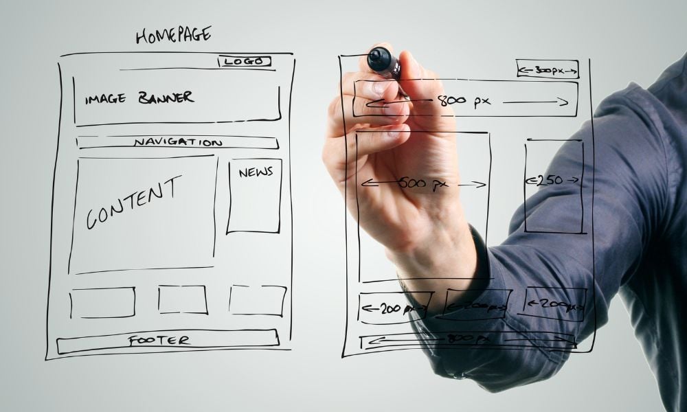
A headline that says what you do
Not a slogan. Not a value. A plain statement of what the business does and for whom.
“Excellence in every detail” tells a visitor nothing. “Residential remodeling in Edmond and north Oklahoma City” tells them everything they need to decide whether to keep reading.
You can be interesting after you have been clear. Most homepages try to be interesting first and never get around to clear.
Your location, visible without scrolling
For any business serving a geography, this is the second most important thing on the page and it is routinely buried in the footer.
A visitor who cannot tell within a few seconds whether you serve their area will leave. Put the city or region in the headline, the subhead, or immediately beneath.
One primary action
Call, book, request a quote, get directions. Pick the one you most want and make it the most prominent element on the page.
Secondary actions can exist. They should look secondary. A homepage with five equally weighted buttons has no call to action, it has a menu of ways to hesitate.
Enough proof to be credible
Reviews with a star rating, years in business, licensing, a recognizable client or two, relevant certifications. A small amount, placed where someone deciding will see it.
Real beats impressive. Three specific reviews with names outperform a claim about thousands of satisfied customers.
What you actually offer, briefly
A clear list of services with links to real pages. Not paragraphs about each one. The homepage routes people. The service pages do the selling.
A reason you rather than someone else
One or two genuine differentiators, stated plainly. If the only thing you can come up with is quality, integrity, and customer service, you do not have a homepage problem. You have a positioning problem, and no design solves it.
Real photography of your actual work
Your people, your projects, your space. Stock photography of a generic smiling team in a generic office is the clearest signal on the internet that a business has nothing specific to show.
What does not belong
A carousel
Rotating sliders exist because they let a committee avoid choosing. Visitors largely ignore them, they push real content down, they hurt load speed, and by the time someone reads slide one, slide two has arrived.
If five things are competing for the hero, the decision about which one matters most has not been made. Make it.
An autoplaying video with sound
Universally disliked. Slows the page. Sends people scrambling for the mute button or the back button.
A silent background loop can work if it is short, compressed, and does not delay the headline. A full brand film belongs further down, playable by choice.
A popup that arrives in three seconds
A visitor who has not yet worked out what you do is not going to join your newsletter. All an immediate popup does is add a step between the person and the information they came for.
If you use one, trigger it on exit intent or after real engagement, and make it easy to dismiss on a phone.
Your company history
Founded in 1987 by a family with a vision. This matters to you and to almost nobody visiting for the first time. It belongs on the About page, where the people who care will find it.
A wall of text about your philosophy
Nobody reads it. If it is genuinely important, it is a service page or an About page. On the homepage it is scroll depth standing between a visitor and the thing they need.
Every service you have ever offered
A list of twenty-eight services makes a business look unfocused and makes a visitor work. Lead with the ones that drive revenue. The rest live on the services page.
A chat widget covering the phone number
Check this on a phone. A distressing number of sites have a chat bubble sitting directly on top of the call button in the mobile layout, which is an expensive place to put a widget.
Awards from 2014
A badge with an old date on it works against you. Either update it or remove it.
Order, roughly
A structure that works for most local and service businesses.
- Headline saying what you do and where, with the primary action.
- A short credibility line: rating, years, licensing.
- Services, scannable, linked out.
- Why you, in one or two specifics.
- Real work, shown.
- Reviews, a few, with names.
- A short about section with a link to the full one.
- A closing action with phone, location, and hours.
You can reorder this for good reasons. Reorder it for no reason and you usually end up back at the committee page.
Two things to check that are not design
Load speed on mobile, on cellular data. A beautiful homepage that takes six seconds to appear is not a beautiful homepage. Oversized images are almost always the cause.
Whether the form works. Submit your own contact form today and confirm somebody sees it. Broken forms sit undetected on live sites for months, quietly collecting nothing.
We cover both, and eight other checks, in our guide to auditing your own website in an afternoon.
The hard part
Every item on the do-not-include list is there because someone wanted it. Removing things from a homepage means telling people no, and that is why so few homepages are good.
The question to settle every argument: does this help a stranger decide faster? If not, it goes somewhere else on the site or it goes away.
We build websites for businesses across Oklahoma and you own everything, source files included. If you want an honest read on what your homepage is currently communicating, send us the link.
More from Design Thumbprint

Tips and Tricks for Effective Email Marketing
Email marketing remains one of the most powerful tools in a marketer’s arsenal. When executed…

What Actually Works on Social Media for a Local Business
Social advice is written for brands with audiences, not for a plumber in Edmond. What actually works for a local business, which platforms are worth it, and what to measure.

What is SEO and What It Means for Your Business Website
In the digital age, having a strong online presence is crucial for the success of…
Want this kind of thinking applied to your marketing?
We are a boutique agency in Edmond working with businesses across Oklahoma and beyond. If something here raised a question about your own marketing, ask us directly.
- Call
- 405-766-6169
- info@designthumbprint.com